# Typing Speed by Font: Does Typeface Matter?
You're staring at your keyboard, fingers poised and ready to obliterate your personal typing speed record. You've warmed up, you've stretched your wrists, you've even eliminated distractions. But there's one variable you probably haven't considered: the font staring back at you from your screen. Does your typeface actually matter when it comes to typing speed? The answer is more nuanced than a perfectly kerned headline, and frankly, more fascinating than you'd expect.
# The Font Factor: More Than Aesthetic Appeal
Most typing enthusiasts focus on the mechanical aspects of speed improvement—keyboard switches, finger positioning, and practice routines. These are important, absolutely. But what if I told you that something as seemingly trivial as the font on your screen could influence your WPM by measurable percentages? Welcome to the intersection of typography, neuroscience, and typing optimization.
Font selection isn't just about making your typing test look pretty. The typeface you're reading from directly impacts how quickly your brain processes visual information. When you're chasing that elusive 150 WPM typing speed or trying to shave milliseconds off your personal best, every advantage counts. This is where font psychology enters the chat.
# The Science Behind Typography and Reading Speed
Here's what the research tells us: fonts affect cognitive load. Cognitive load is essentially how hard your brain has to work to process information. When your brain is working harder to decode letters, it's working slower. When it's working easier, you type faster. Simple cause and effect.
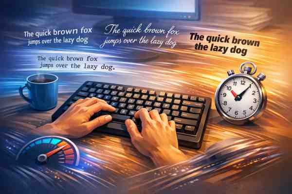
Studies in cognitive psychology have shown that sans-serif fonts—typefaces without the little decorative lines at the end of letters—generally require less cognitive effort to read. Fonts like Arial, Helvetica, and Verdana present letterforms in their most stripped-down, efficient form. Your brain recognizes them faster. Your fingers respond faster. Your typing speed increases.
Conversely, serif fonts like Times New Roman, while elegant and traditional, include those extra decorative flourishes. For long-form reading on paper, serifs actually help guide the eye across lines. But on a screen? That's a different story. The pixels required to render serifs at smaller sizes can create visual noise. Your brain has to work harder to distinguish individual letters. Your WPM suffers.
# Monospace Fonts: The Programmer's Secret Weapon
If you've ever noticed that professional typing tests often use monospace fonts—where every character takes up exactly the same width—there's a reason. Fonts like Courier New, Consolas, and Monaco are staples in programming environments for a reason that extends beyond aesthetic preference.
Monospace fonts create perfect alignment and predictability. Every character occupies the same visual real estate. This consistency reduces the cognitive burden on your brain. You know exactly where each letter will appear. This visual predictability translates directly into faster typing speeds. Your brain doesn't need to adjust for varying character widths. It simply processes letters in a rhythm-inducing, almost meditative pattern.
Data from typing test communities reveals that users consistently achieve higher WPM scores on monospace fonts compared to proportional fonts. The difference isn't massive—we're talking 3-7% in most cases—but in a competitive typing community, that's the difference between good and great.
# Font Size and Clarity: The Goldilocks Principle
Before we get too deep into typeface selection, let's talk about size. Font size directly impacts reading speed, and therefore typing speed. Too small, and you're squinting. Your eyes strain. Your brain works harder. Too large, and you're moving your eyes too much. The sweet spot? Most research points to 14-16 pixels for on-screen reading.
But here's where it gets interesting: the same size font rendered in different typefaces can appear dramatically different. This is called "optical size." A 14-pixel Arial might look noticeably larger than 14-pixel Helvetica. This perceived size difference affects reading speed and typing speed independently of the actual pixel measurement.
The best typing test platforms account for this by using fonts specifically optimized for screen readability. They understand that the marriage of typeface choice and size creates either friction or flow in the typing experience. One creates faster WPM. The other creates frustration.
# Ligatures and Kerning: The Micro-Optimizations
Ligatures are special character combinations where two or three letters merge into a single shape. The "fi" or "fl" combinations in fancy fonts are classic examples. While they look beautiful, they can actually slow down typing speed. Why? Because your brain is recognizing a combined glyph instead of individual letters. It's processing slightly different information than usual.
Kerning—the adjustment of space between specific letter pairs—operates in the opposite direction. Good kerning makes text easier to read. Your brain processes letterforms with less effort. Poorly kerned text creates visual awkwardness. Your eyes have to work harder. Your typing speed drops.
Professional typing test websites use fonts with optimized kerning and minimal ligatures specifically to create the fastest possible typing experience. It's the difference between casual typing and competitive typing optimization.
# The Personal Preference Variable
Here's where things get delightfully complicated: personal preference matters more than you'd think. If you spend eight hours a day staring at Courier New, your brain becomes optimized for that typeface. You might actually type faster in Courier New than in the theoretically "optimal" sans-serif font, simply because your neural pathways have adapted to that specific visual stimulus.
This is why professional typists often develop strong preferences for specific fonts. They're not being difficult—they're leveraging neuroplasticity. Their brains have literally rewired themselves to process that particular typeface with maximum efficiency.
The practical takeaway? Yes, font choice matters. But your personal typing speed optimization path might differ from someone else's. This is where testing becomes invaluable. Trying a typing test with different fonts and tracking your results gives you concrete data about which typeface helps you achieve your best WPM.
# Practical Font Recommendations for Typing Speed
If you're looking to optimize your typing test performance, consider these evidence-based suggestions:
For maximum speed: Try monospace fonts like Inconsolata, Source Code Pro, or Fira Code. These are specifically designed for rapid character recognition and visual consistency.
For comfortable extended typing: Sans-serif fonts like Open Sans, Roboto, or Inter offer a balance between speed and comfort for longer typing sessions.
Avoid: Decorative or script fonts. These are typing speed kryptonite. They might look cool, but your WPM will suffer. Also avoid serif fonts if you're specifically trying to maximize typing speed, though they're fine for casual typing.
# The Optimization Rabbit Hole
This is where we get into life-hacking territory. Once you realize that font affects typing speed, you start wondering about other variables. Does screen brightness matter? Does the background color affect your WPM? What about the specific shade of the text? The answer to all of these is: probably, but in increasingly diminishing returns.
The font choice is one of the bigger controllable variables. The rest are micro-optimizations. Focus on finding your optimal font first. Then, if you're the type of person who loves tweaking variables—and let's be honest, if you're reading this, you probably are—experiment with other factors.
# The Bottom Line
Does typeface matter for typing speed? Absolutely. The evidence from cognitive science, typography research, and data from millions of typing test participants all point to the same conclusion: your font choice influences your WPM. The effect is measurable, repeatable, and significant enough to matter in competitive or personal optimization contexts.
The best font for your typing speed isn't necessarily the most beautiful font or the most popular font. It's the font that allows your brain to process visual information most efficiently while maintaining comfort for extended typing sessions. For most people, that's a modern sans-serif or monospace font at 14-16 pixels.
But here's the real hack: test it yourself. Collect your own data. Try different fonts while taking a typing test, track your WPM, and identify which typeface lets you achieve your personal best. You might discover that you're leaving performance on the table simply by using the wrong font.
Your fingers are probably faster than you think. You might just need to change the typeface to prove it.