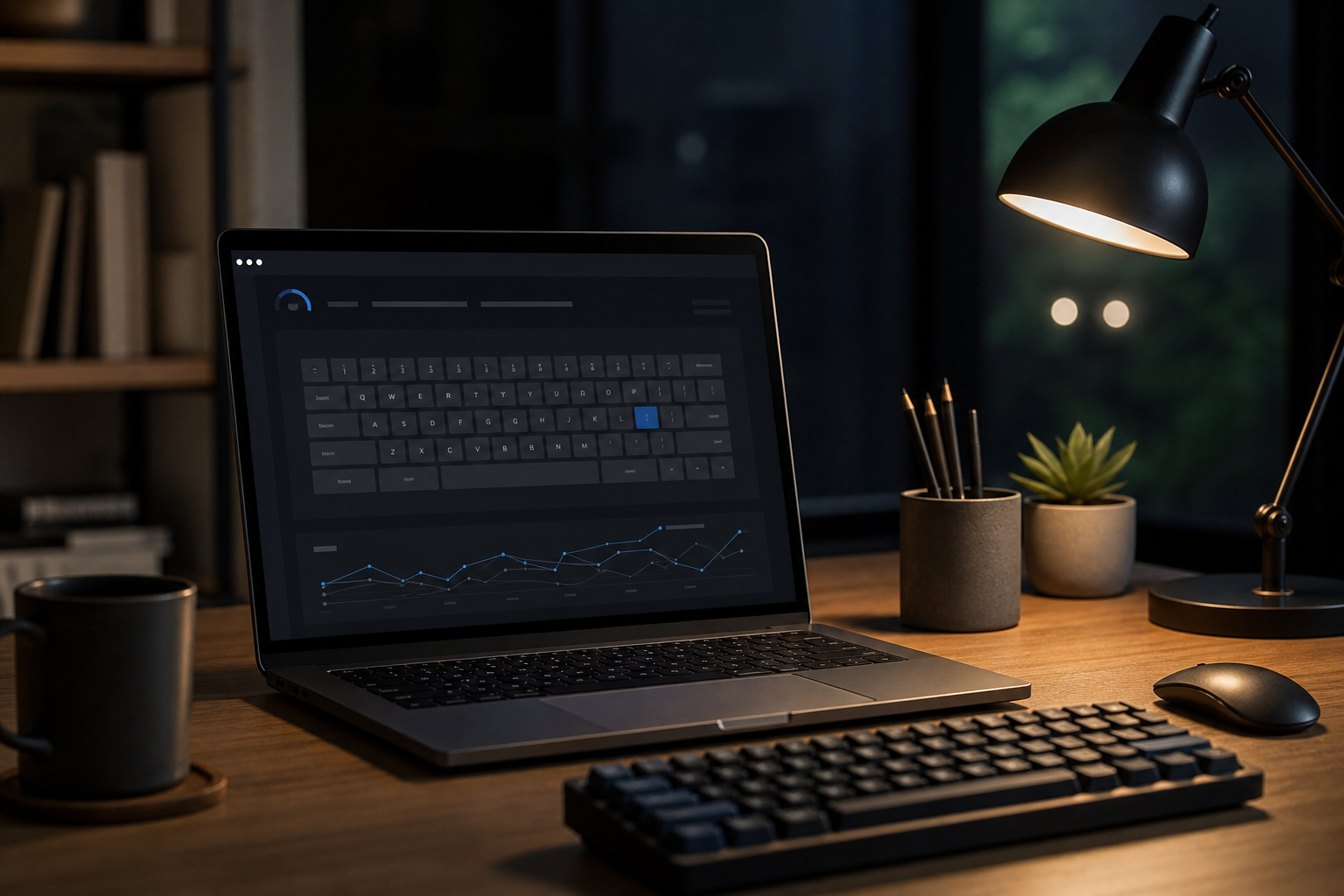
# Typing Test Dark Mode: Measure What It Changes
A typing test dark mode comparison tells you whether your screen theme changes WPM, accuracy, and eye strain under the same conditions. The short answer is simple. Run the same passage in light mode and dark mode, keep brightness and font size fixed, then compare the median run and the strain score. If dark mode lowers discomfort without hurting accuracy, keep it. If it slows you down or makes letters blur together, use light mode or retune the display.
Dark mode changes more than color. It changes glare, perceived contrast, and how hard your eyes work to separate text from the background. That can help in a dim room. It can also backfire when the theme uses thin fonts, weak contrast, or a monitor brightness setting that belongs in a cave. If your typing feels worse in one theme, measure it instead of guessing.
If you want a second baseline for dim rooms, pair this test with the typing in low light keyboard visibility tips guide. If the first minutes of a session are noisy, use the typing warm up guide before you compare themes. If your scores swing because attention is off, the reaction speed test typing readiness is the useful extra check.
# What dark mode actually changes
Dark mode does not make everyone faster. It changes the visual conditions around typing, which can affect speed indirectly. The main variables are glare, contrast, font rendering, and fatigue.
Glare matters first. In a bright room, a white background can reflect more light into your eyes. Dark mode reduces that reflection. That can make long sessions easier to tolerate. In a low light room, the effect is different. A dark background can feel calmer, but if the text is too thin or the contrast too low, your eyes do more work to keep characters sharp.
Font rendering matters too. Some interfaces use a dark theme with light gray text, muted cursor colors, or thin strokes. Those choices look elegant in a design mockup. They can also make punctuation and small letters harder to read at speed. A typing test dark mode should tell you whether the theme helps your work or just looks disciplined.
The related low light posts cover the environment side of this problem from different angles. The older typing in the dark guide focuses on keyboard visibility. This post focuses on the theme itself and how to compare it fairly.
# Run a fair 15 minute comparison
Use the same passage, the same keyboard, the same browser, the same chair height, and the same room. If any of those change, the result becomes a mood report with numbers attached.
- Pick one passage that is long enough to matter but short enough to repeat. Keep it constant for all runs.
- Set the monitor brightness to one level and leave it there. Do not let the room temperature of your screen drift into the experiment.
- Run one warmup pass in light mode. Do not score it.
- Run two timed light mode rounds. Record WPM, accuracy, and eye strain.
- Switch to dark mode and run two timed rounds with the same passage.
- Repeat the whole sequence on another day if the result is close or if the first day felt unusually good or bad.
Alternate the order on the second day. If you always start with light mode, the second theme inherits fatigue and attention drift. If you always start with dark mode, the same problem appears in the other direction. The comparison only works when order does not decide the outcome for you.
If you need a practical rule, use this one. Light mode and dark mode each get two scored rounds. Keep the median of each theme. Ignore the best run. Your keyboard already has enough optimism.
# Score the result with four numbers
A single WPM number is too blunt for this test. Dark mode can change comfort without changing speed, and that is still useful. Use a small scorecard.
| Metric | How to record it | What it tells you |
|---|---|---|
| Median WPM | Middle score from the two timed rounds | Whether the theme changes pace |
| Accuracy | Correct characters or final accuracy percent | Whether readability changes error rate |
| Eye strain | 1 to 5 rating after each round | Whether the theme helps or tires your eyes |
| Recovery cost | Seconds spent fixing missed letters, punctuation, or cursor position | Whether the theme changes correction flow |
| Contrast confidence | 1 to 5 rating for how clean the text looked at speed | Whether letter shape felt crisp or muddy |
The important row is not always WPM. A theme that drops speed by one point and cuts eye strain in half may still be the better choice for a long writing session. A theme that boosts WPM but leaves your eyes feeling like they filed a complaint is only winning the spreadsheet.
If your eye strain score jumps after the first few minutes, do a second pass after a short break. That often separates true theme benefit from the early novelty of a new display look.
# Decide what the data means
Use the result pattern, not the vibe.
| Result pattern | What it usually means | Next move |
|---|---|---|
| Dark mode improves WPM and lowers strain | The theme fits your room and font settings | Keep dark mode and save the setup |
| Dark mode lowers WPM but lowers strain | The theme helps comfort more than speed | Use it for long sessions, then test a larger font |
| Dark mode raises WPM but raises strain | The theme is fast but expensive | Keep it for short work blocks only |
| Light mode wins on both speed and comfort | Your current dark theme is the problem | Fix contrast, font weight, or brightness before retesting |
| The two themes are close | Theme is not the bottleneck | Focus on warmup, passage difficulty, or keyboard setup |
If the two themes are close, stop treating theme choice like a personality test. The result says your typing skill is stable enough that another variable matters more. That variable may be text difficulty, keyboard feel, room brightness, or how tired you were when the test started.
If you want a more stable starting point before any comparison, revisit the reaction speed test typing readiness article. It catches the slow start problem before you blame the screen theme for your lunch.
# Tune the screen before you blame the theme
Dark mode failures often come from the settings around the theme, not the theme itself. Before you give up on it, adjust the display in small steps.
- Increase body text size until punctuation stays crisp at normal typing distance.
- Raise contrast between background and text until letters stay separated during quick scanning.
- Use a slightly heavier font weight if thin strokes blur in the dark.
- Check the cursor color. A weak cursor can slow correction more than the text itself.
- Keep room light stable. A dark screen in a bright room and a bright screen in a dark room create different problems.
- If your keyboard has backlighting, set it low enough to help key location without washing out the screen.
For accessibility and contrast baselines, the W3C explains the contrast minimum (opens new window) for readable text. WebAIM’s contrast checker (opens new window) gives you a quick way to test foreground and background pairs. Android’s dark theme guidance (opens new window) is useful if you are comparing system themes or app themes on a phone and want to see how a dark palette behaves in practice.
Those sources point to the same habit. Measure contrast instead of trusting a nice looking screenshot. A screenshot can be stylish. Readability has less interest in style points.
# A one week dark mode test plan
A one day comparison tells you what happened that day. A one week plan tells you whether the result repeats.
# Day 1
Run the 15 minute comparison. Save the scorecard and the room settings. Do not change font size, zoom, or brightness after the test.
# Day 3
Pick the winning theme and use it for normal work. Then run one short verification block with the other theme at the same settings. This checks whether the first result was just a lucky run.
# Day 5
Repeat the comparison after a warmup. If your first run was shaky on Day 1, this is where you learn whether the theme or the warmup was the real issue.
# Day 7
Do a longer session, then score eye strain again. Some themes feel fine for three minutes and tedious after twenty. That is the difference that matters.
If Day 7 matches Day 1, the choice is probably real. If the result flips, your setup still has a variable that needs control. In that case, return to the low light guide and tune the room before you tune the theme again.
# Common mistakes in a dark mode typing test
The first mistake is changing too many settings at once. Dark mode, font size, zoom, brightness, and keyboard backlight all interact. If you change all of them, the comparison stops being about dark mode.
The second mistake is using one lucky run. Single runs flatter whatever happened to line up with your focus. Median scores are less dramatic and more useful. Minor tragedy for the scoreboard, major benefit for the reader.
The third mistake is reading speed alone. A faster score with worse accuracy can create more correction work, which erases the gain.
The fourth mistake is comparing your home setup with a different room. Lighting changes the result. So does screen distance. So does posture. The room is part of the test.
The fifth mistake is assuming dark mode is always the answer. It is a setting, not a moral stance.
# Conclusion
A typing test dark mode comparison tells you whether the theme helps or hurts your real typing. Keep the setup constant, run the same passage in both themes, and compare WPM, accuracy, strain, and correction cost. If dark mode improves comfort without weakening text clarity, keep it. If it lowers readability, fix the contrast and font first, then retest.
The goal is not to defend a theme. The goal is to make typing easier to sustain. That leaves you with the useful kind of progress, the sort that shows up again tomorrow and does not require a ritual explanation to the spreadsheet.